-
The old checklist was for single products. The new checklist is for sets.
-
Greeting cards and wedding cards: print standards still matter
-
Jar candles and candle holders need a different set of eyes
-
AI proofs can suggest, but they can't replace physical proof
-
What about the PDF proof?
-
What I would put in the 2025 quality spec
Here's the opinion that gets me sideways glances at industry meetings: most quality complaints we handle aren't about defective products; they're about mismatched expectations. A buyer sees a sample, approves it, then gets angry when the full delivery doesn't look like the marketing image. The product may be fine. The expectation was set using an older definition of quality.
I'm a quality and brand compliance manager at American Greetings. I review every deliverable before it reaches customers—roughly 200 unique items per season. Over four years of reviewing deliverables, the pattern has changed. What was best practice in 2020 doesn't work for the products that reach my table in 2025.
The old checklist was for single products. The new checklist is for sets.
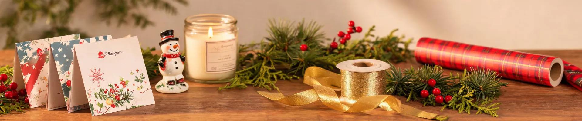
People still think about greeting cards and candles as separate industries. American Greetings' catalog doesn't. A retail display order can include American Greetings wedding cards, American Greetings birthday candles, a jar candle, and a candle holder designed to sit together on a shelf. Each item can pass its own test. Together, they can look like they came from four different brands unless someone checks the set.
Today's B2B demand is coordinated gifting: the same color story across paper, wax, and ceramics. My job is to make sure the set itself feels deliberate. If a jar candle lid color doesn't repeat the envelope lining color from the wedding card next to it, a customer will notice even if both products are within their individual specs. That has changed how I write inspection criteria.
Greeting cards and wedding cards: print standards still matter
For printed paper, the basics haven't moved. Standard commercial print resolution is 300 DPI at final size. If a supplier sends an image at 150 DPI, the math still applies: 3000 x 2000 pixels at 300 DPI will only print clearly at about 10 x 6.67 inches. If the card is larger than that, it isn't a little soft; it's the difference between crisp type and a professional-looking product.
Color is another shared language. I use Pantone's Color Matching System guidelines as a starting point. For brand-critical colors, Delta E should be below two. Between two and four, trained observers will notice. Above four, most people will notice. When someone says a color is close enough, close enough usually means Delta E over four.
Paper weight is easier to check than people think. A 100 lb text stock is roughly 150 gsm; an 80 lb cover is about 216 gsm. If your spec asks for a premium card but the supplier can't tell you which of those standards you are holding, the project is already risky.
With wedding cards, the envelope is part of the product. An American Greetings wedding card might use a warm white panel, but if the envelope is pure white, the set looks wrong. That isn't a manufacturing defect. It's an assembly problem. And it will produce customer returns if nobody checks it.
Jar candles and candle holders need a different set of eyes
From the outside, ordering a jar candle looks simpler than ordering a printed card. The reality is that candles involve wax behavior, wick placement, fragrance load, and label adhesion. A jar candle can fail after it leaves the factory if the wick is off-center or the fill line varies. I'm honestly not sure why fill heights are still inconsistent from some vendors. My best guess is they fill by time rather than weight. The result is a shelf of candles at three different levels.
Then add a candle holder to the order. Glaze color, opening diameter, and base stability all need to be verified. Here's the part that surprises procurement: glass and ceramic take color differently, so a candle jar and a glazed candle holder rarely match in the same way. If your plan is for them to match, you need a physical side-by-side sample before production, not just individual digital swatches.
American Greetings birthday candles fall into the same trap. They're small and inexpensive, so buyers treat them as low-risk. But a tray of birthday candles with one crooked wick or a tight cell pack gives a bad first impression. Small thing? Not if a customer opens the pack and sees six candles at seven different angles.
AI proofs can suggest, but they can't replace physical proof
Let me answer a question I see a lot in search reports: does paint by number app use ai? Yes, it does. Most current paint by number apps use AI to turn a photo into numbered color regions. I've used similar tools to build quick moodboards and concept previews. They can save real time.
AI-generated images are still renderings, though. They weren't printed on paper, and they weren't fired in a kiln. An AI mockup can't tell you if a candle wick is centered or if a jar candle label is going to bubble in transit. Digital tools are changing the front end of product development, not the back end of quality.
What about the PDF proof?
One counterargument I hear from buyers is that the vendor's PDF proof looks exact. Sometimes it is. For flat printed ink, a properly calibrated proof can tell you a lot. But a PDF can't show material thickness, ceramic glaze, or how wax reacts to heat. If you're ordering a card and a box, PDF proofing is probably enough. If you're ordering a jar candle, a candle holder, and a card that all have to sit together, no digital proof does the whole job.
Another pushback is the supplier relationship: we've used the same vendor for a decade and they know our colors. Long-term relationships matter. But if that trusted vendor has never produced a jar candle for you, their experience with cards doesn't automatically transfer to wax and glass. I've learned that lesson the hard way; this isn't a theoretical concern.
What I would put in the 2025 quality spec
I'm not saying every small order needs a full inspection lab. I'm saying the purchase contract should include enough precision to be useful:
- A minimum resolution of 300 DPI at final size for all printed source art.
- A color tolerance target based on Delta E, using Pantone references for brand colors.
- A physical pre-production sample of every SKU before production, not only an online proof.
- A side-by-side sample of the full set whenever the order includes separate materials like paper, wax, and ceramic.
The fundamentals haven't changed: you still need a physical product that matches what the customer expects. But the execution has changed. The old checklist got you through a carton of identical greeting cards. The new one has to handle wedding cards, birthday candles, jar candles, and candle holders as one visual system. That's not a higher standard of perfection. It's a higher standard of coordination.
If I sound opinionated, it's because I've watched too many good products fail in the final pairing. American Greetings is a brand built on occasions; no one wants the occasion remembered for a mismatched envelope or a wobbly candle holder. In my experience, quality isn't the headline feature. It's the reason the next order happens.

Elise Laurent
Elise Laurent is a crystal and decorative glass quality analyst covering crystal figurines, vases, ornaments, suncatchers, and gift glassware. She examines ISO 6486-1 where food-contact glass dinnerware applies, then uses polarized strain inspection, dimensional checks, surface-defect grading, and refractive clarity to compare decorative pieces outside that scope. Her work helps sourcing teams choose materials, finishing routes, and protective packaging without confusing visual brilliance with verified durability.